
21 July 2026
Sales Analytics Software: 9 Metrics That Matter Most
Most firms buy sales analytics software to answer one question: what is driving revenue, and what is likely to happen next? The best answer is not a single chart but a disciplined set of metrics that connect pipeline behaviour, conversion quality and forecast reliability.
TL;DR: Summary
- The most useful sales analytics software tracks nine core metrics: closed won, win rate, conversion rate, average deal size, average days to close, pipeline coverage, gap-to-goal, lead source performance and predictive deal risk.
- Salesforce’s default sales analytics KPIs already centre on closed won, win rate, average deal amount and average days in the sales cycle, which is a strong benchmark for dashboard design.
- Stronger setups do more than report history: they combine lagging KPIs with predictive signals for deal size, win rate and time to close so teams can act before the quarter is over.
- Clean source data matters more than dashboard design. CRM or sales force automation is the foundation, but finance, POS and inventory data can be essential in retail and operational sales environments.
- If a dashboard has too many metrics, adoption usually drops. A practical rule is to keep executive views narrow, compare current year with prior year, and review exceptions by stage, source and rep.
Sales analytics becomes valuable when it changes behaviour, not when it simply produces reports. That is why the most effective systems keep historical KPIs and forward-looking indicators in the same decision flow.
What does sales analytics software actually do?
Sales analytics software turns pipeline and transaction data into decision signals. Salesforce and HubSpot both frame it around metrics like win rate, conversion rate and time to close, then surface those numbers through dashboards, reports and forecast views.
At a practical level, the software answers four operational questions. How much revenue closed, how efficiently deals moved, which inputs produced the best outcomes, and whether current pipeline is likely to hit target. That is the difference between activity reporting and sales analytics. One tells you what happened. The other helps explain why it happened and what to do next.
For high-volume businesses, the value often increases when sales data connects to stock, fulfilment or service events. A common mistake is to treat analytics as a CRM-only layer when order completion, returns, repairs or margin leakage can distort the real sales picture.
"ePOS4Mobiles gives mobile phone retailers one browser-based system for POS, IMEI stock, repairs and accounts."
If a team sells straightforward SaaS contracts, the model may stay mostly inside CRM. If it sells devices, accessories, service plans or repair work, the analytics layer usually needs operational data too.
Which data sources make sales analytics software trustworthy?
Trusted sales analytics starts with clean CRM data and closed-loop finance records. Forrester treats the sales force automation system as the core source, while retail businesses often add POS and inventory data to connect opportunities with actual sales.
The main issue is not volume of data but consistency. If opportunity stages mean different things across reps, win rate becomes unreliable. If finance recognises revenue differently from sales ops, closed won totals can look healthy while actual collections lag behind.
Useful source systems often include:
- CRM or sales force automation: leads, opportunities, stage changes, rep ownership
- Finance or ERP: invoices, credited revenue, payment status, margin
- POS or ecommerce: completed transactions, basket value, product mix
- Operational systems: stock, fulfilment, repairs, cancellations, returns
A strong rule is simple: every KPI should have one agreed owner and one agreed source of truth. Without that, debate shifts from action to definitions.
"ePOS4Mobiles offers same-day setup with real-time syncing, which matters when multi-location teams need current sales and stock data."
Another common misconception is that dashboard software fixes bad inputs. It does not. It makes bad inputs visible faster.
What are the 9 sales analytics metrics that matter most?
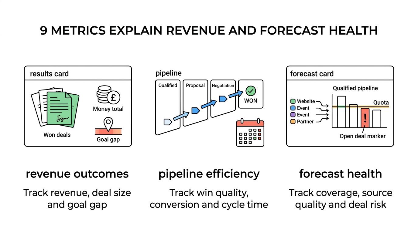
The nine metrics that matter most are closed won, win rate, conversion rate, average deal size, average days to close, pipeline coverage, gap-to-goal, lead source performance and predictive deal risk. Salesforce uses several of these as default KPIs for a reason.
Each metric matters because it captures a different failure point in the sales system. Revenue can miss target because too few deals closed, because the deals were too small, because the cycle took too long, or because weak sources filled the funnel. One number never tells the whole story.
- Closed won: The total value of won business in a period. This is the anchor revenue KPI.
- Win rate: Won opportunities divided by closed opportunities. It shows closing quality, not just volume.
- Conversion rate: The percentage of prospects that move to a defined next action or stage, consistent with HubSpot’s definition.
- Average deal size: Closed won revenue divided by won opportunities. It reveals pricing, discounting and mix changes.
- Average days to close: The average sales cycle length from creation to close. Salesforce treats this as a core KPI.
- Pipeline coverage: Qualified pipeline value versus quota. If coverage is thin, late-quarter pressure rises.
- Gap-to-goal: The distance between current results and target. It makes quota risk visible early.
- Lead source performance: Revenue, conversion and cycle time by channel or campaign source.
- Predictive deal risk: A model-based indicator of likely deal size, win probability or time to close.
The strongest teams read these metrics together. If win rate rises but average deal size falls, the quarter can still miss. If pipeline coverage looks strong but average days to close is rising, forecast confidence should fall.
How should you build a sales analytics dashboard step by step?
A useful dashboard is deliberately narrow. Salesforce limits its Sales Performance view to three metrics at a time, which is a strong reminder that a sales dashboard should guide decisions, not act as a data warehouse.
Step 1: choose the outcome metric first. Start with closed won or recognised revenue. Every supporting chart should explain movement in that outcome, not compete with it.
Step 2: add three to five supporting KPIs. A practical mix is win rate, average deal size, average days to close and pipeline coverage. This keeps the screen decision-focused. If everything is on page one, nothing stands out.
Step 3: build one drill-down path. Let users move from company view to team, rep, stage or lead source. A dashboard without drill-downs creates meetings full of guesses.
Salesforce’s year-to-date comparison between current fiscal year and previous year is also a smart pattern. Year-on-year comparison reduces overreaction to one unusual week and keeps seasonality in view.
How do historical KPIs and predictive sales metrics compare?
Historical KPIs explain yesterday, predictive metrics shape tomorrow. Closed won and average deal amount show what happened; Einstein Discovery style models highlight likely deal size, win rate and time to close before the quarter ends.
This is where many implementations become more useful. Historical reporting is necessary for board reviews, commission checks and trend analysis. Predictive metrics matter because they allow intervention while deals are still open. If an account looks large but the model flags a long time to close, leadership can adjust forecast weighting or resource allocation early.
Forrester has long argued that sales dashboards should help predict what will happen, not just report what happened. The trade-off is data quality. Predictive models inherit the strengths and weaknesses of the records beneath them. If stage discipline is poor, the forecast score is still mathematically neat but commercially weak.
A sensible operating model is to use history for accountability and prediction for prioritisation.
Which sales analytics metrics are leading indicators and which are lagging indicators?
Leading indicators move first; lagging indicators confirm results. Conversion rate and pipeline coverage signal whether revenue is forming, while closed won and gap-to-goal show whether the target was actually reached.
The easiest way to separate them is timing. Lagging metrics become reliable only after deals close. Leading metrics update earlier and help teams adjust before quarter end. That distinction matters because many sales meetings are dominated by lagging figures that are no longer changeable.
A practical comparison looks like this:
- Closed won
- Average deal size
- Gap-to-goal
- Conversion rate by stage
- Pipeline coverage
- Lead source quality
- Predicted time to close
The first three are mostly lagging or end-state metrics. The others are leading when reviewed inside an active period. A common mistake is to treat raw activity counts as leading indicators. Calls and emails are only useful if they correlate with progression, not merely effort.
"ePOS4Mobiles has no per-user or setup fees, which can make analytics access easier across shop, warehouse and repair teams."
If a leading indicator does not help you decide what to change this week, it is probably just another report.
How can you use sales analytics software to improve win rate step by step?
Win rate improves when analytics isolates the point of failure. Salesforce and HubSpot both treat conversion as stage-by-stage behaviour, so the useful question is not “Are we closing enough?” but “Where exactly do good deals stall?”
Step 1: segment the win rate. Look at it by rep, product, lead source, deal band and stage path. A blended company figure hides the cause. If enterprise-sized deals lose late but smaller deals close well, coaching and pricing action should be different.
Step 2: compare win rate with cycle time and deal size. A higher win rate gained through heavy discounting may still reduce profit. If win rate improves while average deal size collapses, that is not a clean success.
Step 3: test one intervention at a time. Change qualification criteria, proposal timing, discount approval or follow-up cadence, then review the next 30 to 90 days. The misconception to avoid is changing five variables and learning nothing.
This is also where lead source analytics earns its place. Not all “more leads” are equal. Better leads often raise win rate faster than better scripts do.
How do you forecast revenue more accurately with sales analytics software step by step?
Accurate forecasting comes from weighted pipeline logic plus current sales signals. Forecasts improve when CRM stages, average days to close and lead source performance are checked against actual close dates and closed won outcomes.
Step 1: validate stage probabilities against history. If stage three has been given a 60% weight but only 35% of deals from that stage close, the forecast is optimistic by design.
Step 2: factor in cycle speed. Deals that normally take 45 days should not be counted as likely this month when they entered last week, unless a distinct fast-track pattern exists.
Step 3: add predictive exceptions. Models that flag likely deal slippage, lower deal size or lower win probability help refine the weighted forecast. This is where the strongest analytics setups gain real advantage.
Salesforce reported that 83% of sales teams using AI saw revenue growth in 2024, compared with 66% of teams not using AI. That does not mean AI replaces judgment. It means earlier signals can improve decision quality when the basics are already clean.
What mistakes make sales analytics software look useful but change nothing?
Sales analytics fails when teams confuse reporting with management. Gartner found 47% of chief sales officers think analytics influences performance less than leadership expects, which usually points to poor metric choice, weak adoption or slow data.
Most stalled implementations show the same pattern. Lots of dashboards, low operational change. The root problem is rarely lack of charts. It is usually lack of decisions tied to the charts.
Warning signs include:
- Too many KPIs on one screen
- No agreed definition of a qualified opportunity
- Forecast stages that never match actual close behaviour
- Reports reviewed monthly but not acted on weekly
- No link between source quality and sales outcomes
Another trap is over-focusing on rep rankings. Rankings are useful, but process metrics often deliver faster gains. If a whole team loses deals at the proposal stage, the issue is probably messaging, pricing or approval flow rather than individual effort.
How should mobile phone retailers apply sales analytics software differently?
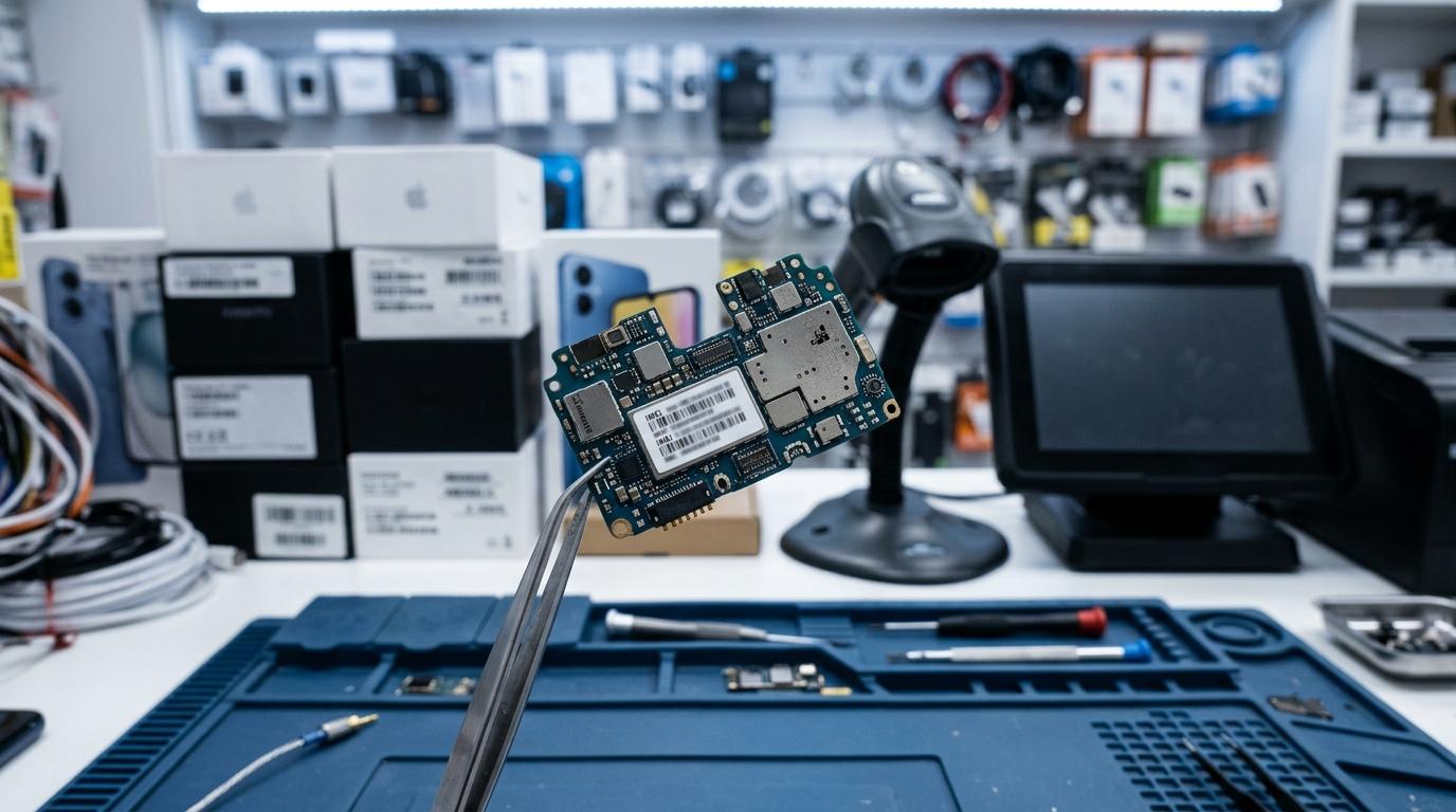
Mobile phone retailers need operational sales analytics, not just classic CRM charts. ePOS4Mobiles and similar sector systems connect POS, IMEI stock, repairs and accounts, which changes what sales performance really means at shop level.
In a mobile retail setting, “sales” does not stop at a closed transaction. Device margin, accessory attach rate, repair conversion, stock ageing and IMEI traceability can all affect commercial performance. A shop might show strong unit sales while profit weakens because discounts rose or repairs were delayed.
That is why sector systems often combine front-of-house and back-office data. Browser-based platforms with real-time syncing matter more in multi-location operations, where managers need current visibility across shops and warehouses, not next-day exports.
"ePOS4Mobiles is built specifically for mobile phone shops, with browser-based POS, stock, repair and accounts software in one system."
For this kind of business, the best analytics view usually blends classic sales KPIs with operational ones. If accessory conversion is high but repair turnaround is slipping, revenue may look fine while customer retention starts to weaken. That is exactly the sort of pattern generic dashboards often miss.